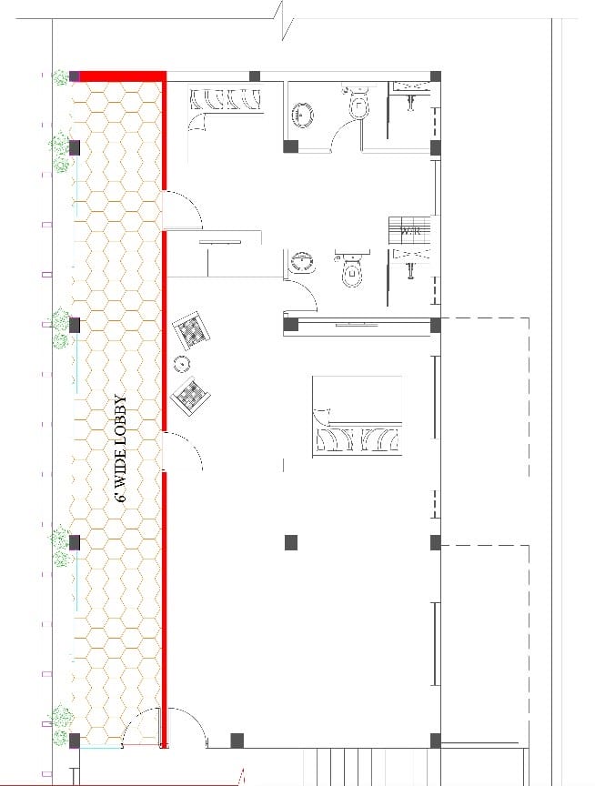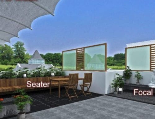
So when we started on the space plan we placed the corridor on the side with less setback & opened the wall between columns so that we can access the setback from the lobby. The compound wall was raised to 8’ and treated with a beautiful floral tile to enhance the view. Now the entire corridor has a facelift with the huge sliding doors along the length of the corridor and also a soothing view of the exterior.


When we remove the exterior wall, we need to factor in the safety aspect also. Hence we erected MS pipes on the compound wall and closed it at first floor level and this became the elevation feature.
My point of emphasis is that the design element should always complement functionality and then the colors and materials can be brought in for aesthetics.


